Role
Senior designer
Company
O.A.T., since 2021
Scope
Web, design systems
Overview
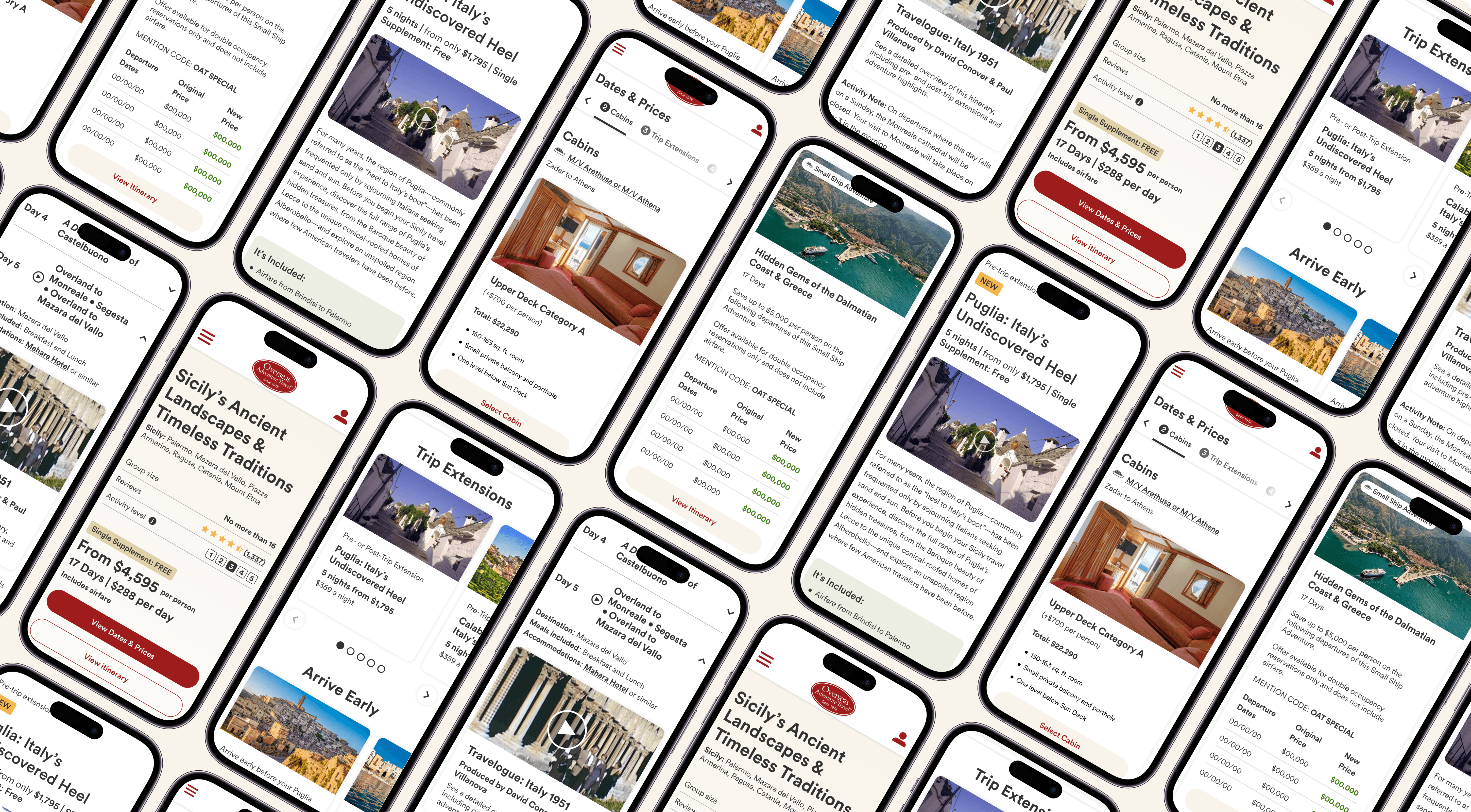
I've worked at Overseas Adventure Travel since 2021, touching everything from hero images to full payment flows. I managed one other designer, and together we owned all of web design, homepage, landing pages, My Account, payment flows, and the design system. This case study covers one specific piece of that work: the Dates and Prices experience travelers use to build a trip before booking.
Problem / Context
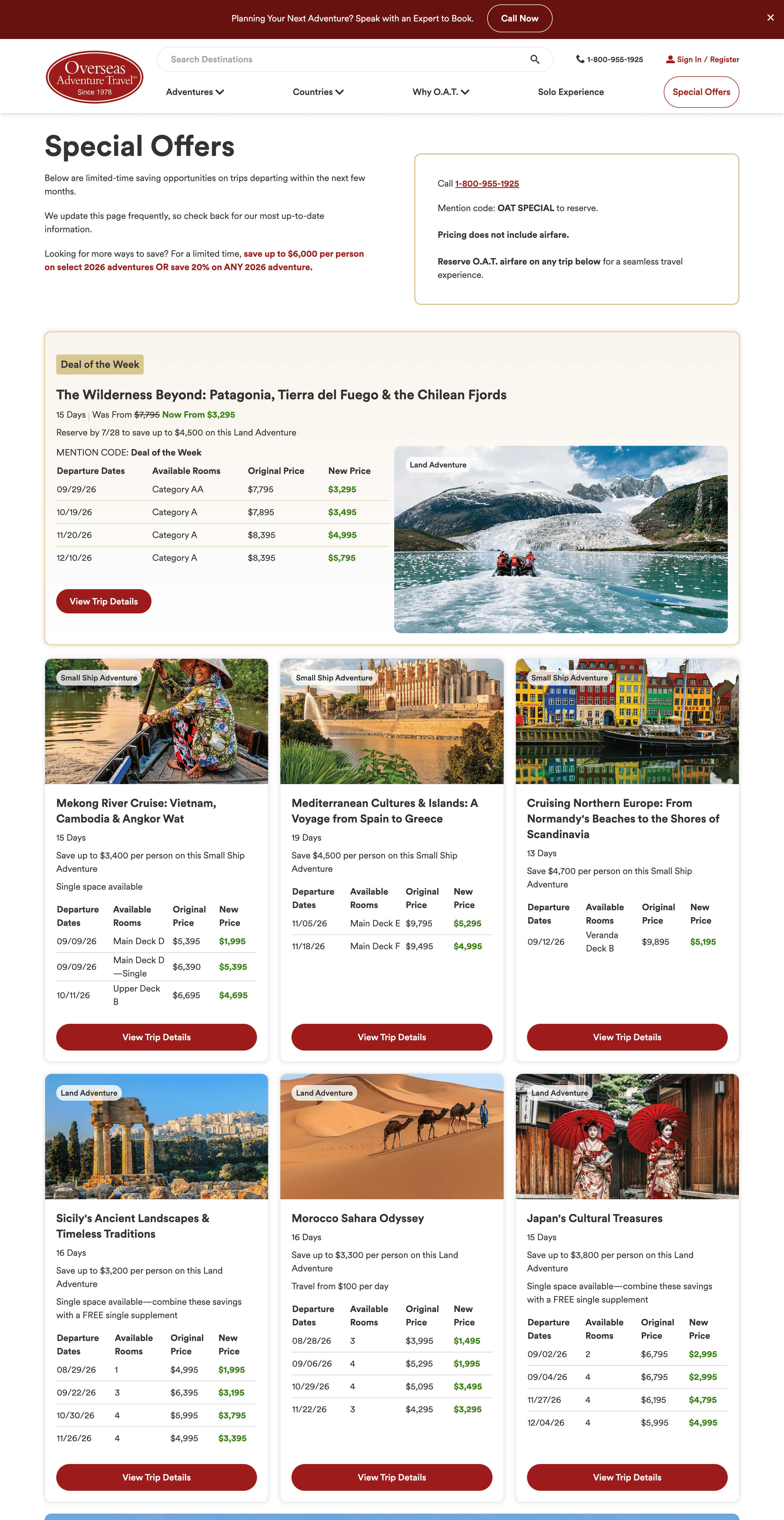
The original flow asked questions out of order. A traveler could select a date before entering occupancy, only to find that date unavailable once party size was known, sending them back to guess again. Icons throughout the flow weren't self-explanatory, and the final page left travelers with no clear action to take next. Building a trip felt like a headache instead of the start of a vacation.
Process
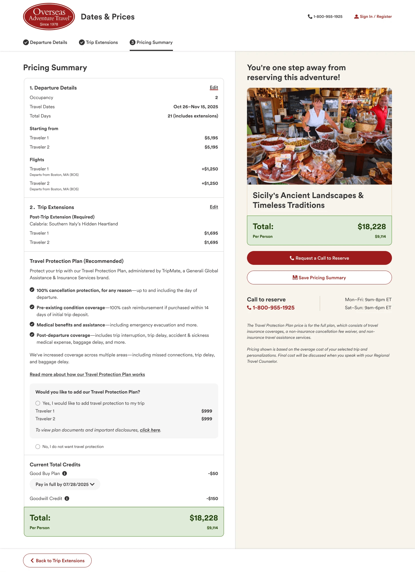
We audited the existing pain points, researched competitors, then mapped the journey we wanted to build toward before wireframing. We knew we wanted a multi-page, cart-style flow travelers could step through, ending with a fully planned trip ready for their eventual call to our booking team.
From wireframes to high fidelity mockups to a prototype, we tested with a focus group of 12 travelers on real tasks. People completed them well, so we moved into development, then revisited the UI again post-launch to match our newest design system.
Before


After - Phase 2


Outcome
11% to 22%
Cart completion
+11 points
vs old design
$12.2M
est. annual impact
The goal was 11% to 20% cart completion, projected to be worth roughly $12.2M in annual net profit and 6,800 additional passengers on our top 30 trips. After full rollout, we reached 22%, beating the goal by 2 points. The lift held as exposure scaled from 1% to 50% of desktop traffic, not just a launch-day spike, and manual saves stayed consistently higher too, a sign travelers were engaging more deeply, not just moving faster.
An early, smaller-sample read also showed a meaningful gap in booking rate favoring the new experience, promising, though not yet confirmed at scale.
what shaped the next round
Findings from testing and demo feedback
Readability mattered more than usual given OAT's older customer base. Free Single Supplement messaging was a stronger value proposition than its visual treatment reflected. Travelers wanted clearer airfare messaging. Showing sold-out cabins turned out to be a useful, low-cost lever for urgency. Navigation and progress visibility came up again and again as the throughline.
Final Thoughts
Dates and Prices still has real issues left to solve. Given more room, I'd flatten the experience and raise it to the product page level instead of keeping it siloed.
I'd also make one decision differently: we removed the top navigation to keep users focused, a pattern borrowed from ecommerce checkout. But this isn't a full checkout, travelers can't book online at the end of it, so removing that navigation left people feeling stuck rather than focused. A good reminder that patterns from one kind of flow don't always transfer cleanly.
None of that changes the results. The redesign meaningfully improved how travelers built their trips, and the numbers backed it up. Those same findings, especially around navigation, progress visibility, and surfacing the right value propositions, are directly shaping the current round of PDP and Dates & Prices work I'm involved in now.